2023
Kamadhenu

View full case study PDF
Background
Kamadhenu pioneered an AI technology that automated Visual Merchandising for Bata. As the scope of the app grew, additional features were added one-by-one, on top of each other, rather than with the task flow of users in mind. I was brought on board to redesign the app from the ground-up for two distinct user groups - store managers, who were receiving and completing tasks, and higher level managers, who were assigning and overseeing tasks.
Core problem
Lacking Campaign Task Context for Store Managers
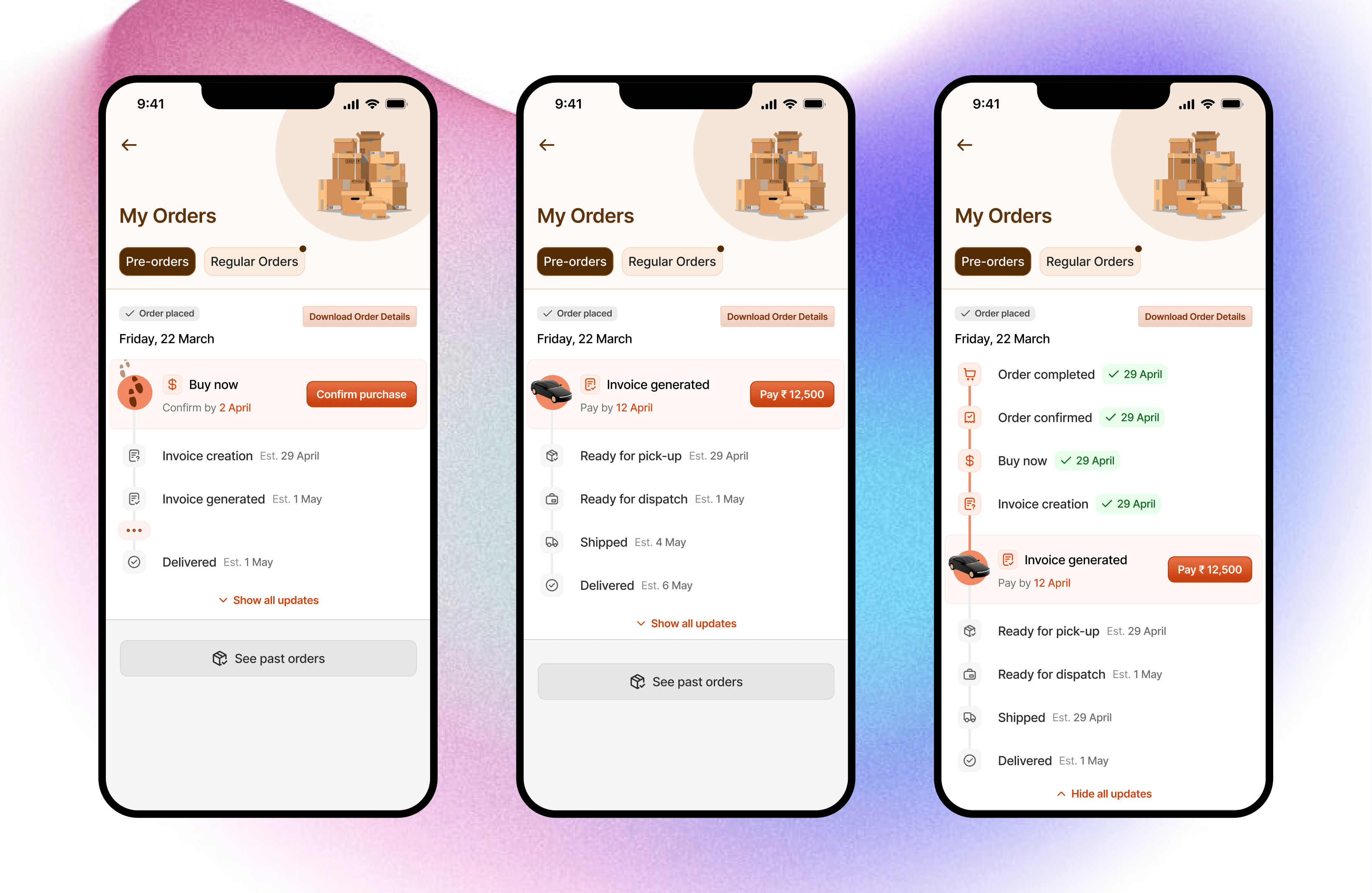
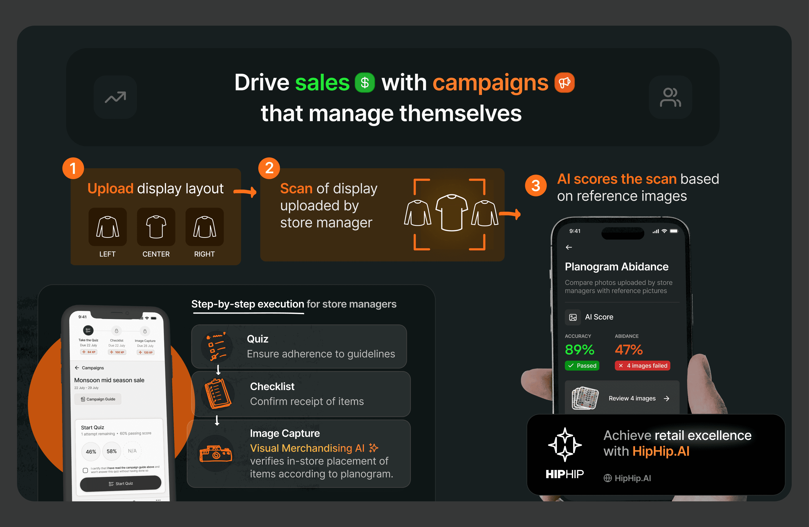
The app was deployed as an MVP, solely with the Visual Merchandising (Image Capture) feature deployed. The next iteration requested involved making the image capture one of multiple steps involved in a retail campaign - quiz, checklist, image capture.
The execution of the full campaign experience lacked broader context, forcing users directly into the task as opposed to providing them with a preparatory screen that briefed them before they engaged in a task. I believed this was the reason for the observed drop in voluntary app usage from 86% to 71%.
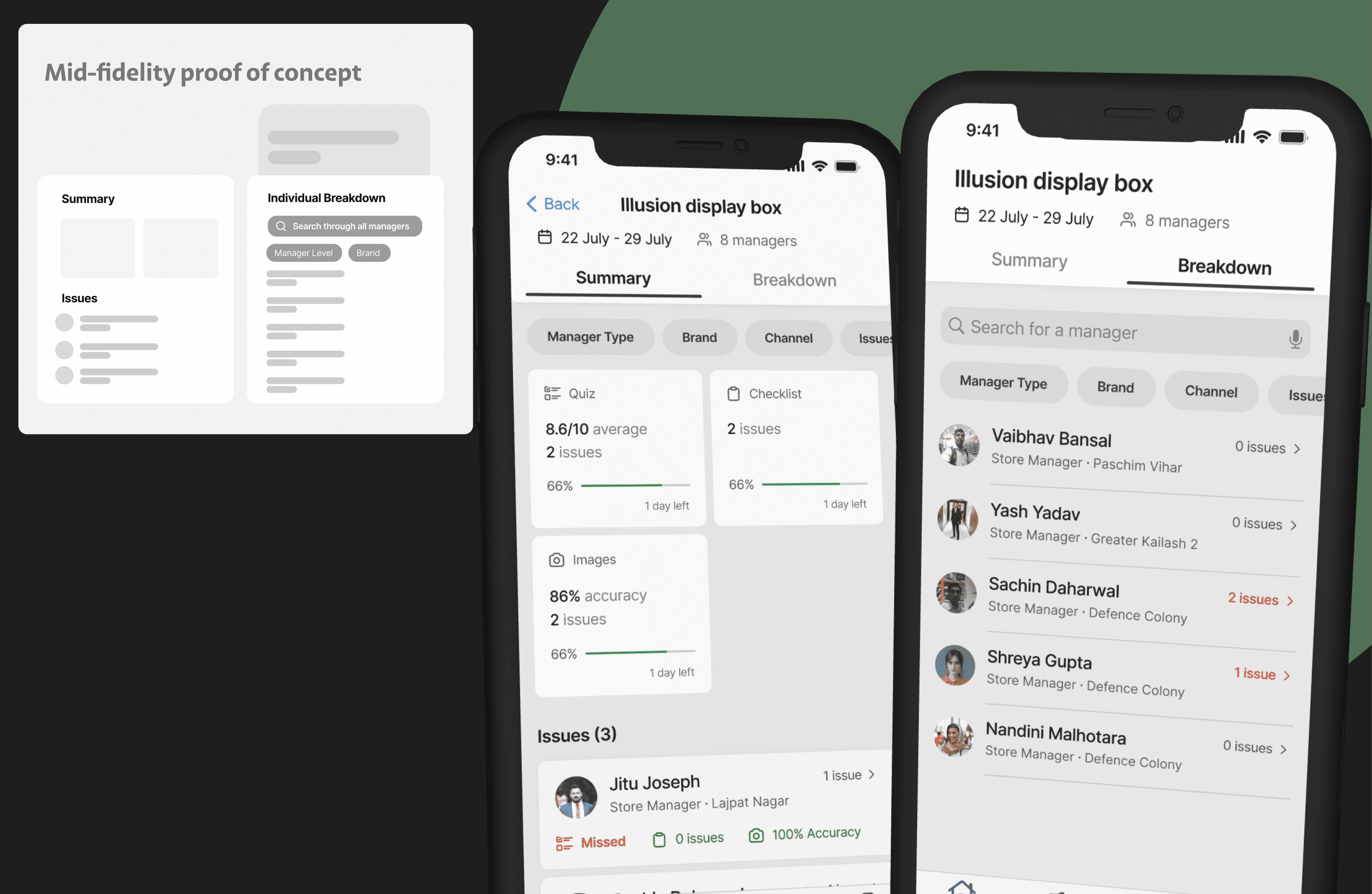
Unintuitive Campaign Summaries for Higher Level Managers
In user interviews, higher level managers shared their frustrations with the in-app campaign reporting, saying there's too much information that feels unstructured. They specifically mentioned the never-ending nested dropdowns that were required to filter down from a region to a specific store. With unexplained icons and a lack of visual hierarchy, it took too many taps to get to issue management.
The Approach for HipHip
After carefully mapping out common task flows, I aimed to provide additional, implicit context via the UI as opposed to explicit step-by-step instructions which hijacked the interface.
Steps Taken
Campaign Task Context: To facilitate an intuitive task flow for campaign completion, an intermediary screen that gave task-specific information was added before the task environment screen itself. This included campaign steps at the top of the screen and a task-specific context chip at the bottom. e.g. for the quiz task, the context chip showed the remaining attempts, passing score and previous scores.
Replacing nested drop-downs with segmented control: The tap-intensive nested drop-downs for campaign reporting information were a major source of frustration. After analyzing the information hierarchy, I decided a segmented control would offer a more user-centric experience, with the summary tab including overall statistics and specific issues, and the breakdown tab having store-specific information.
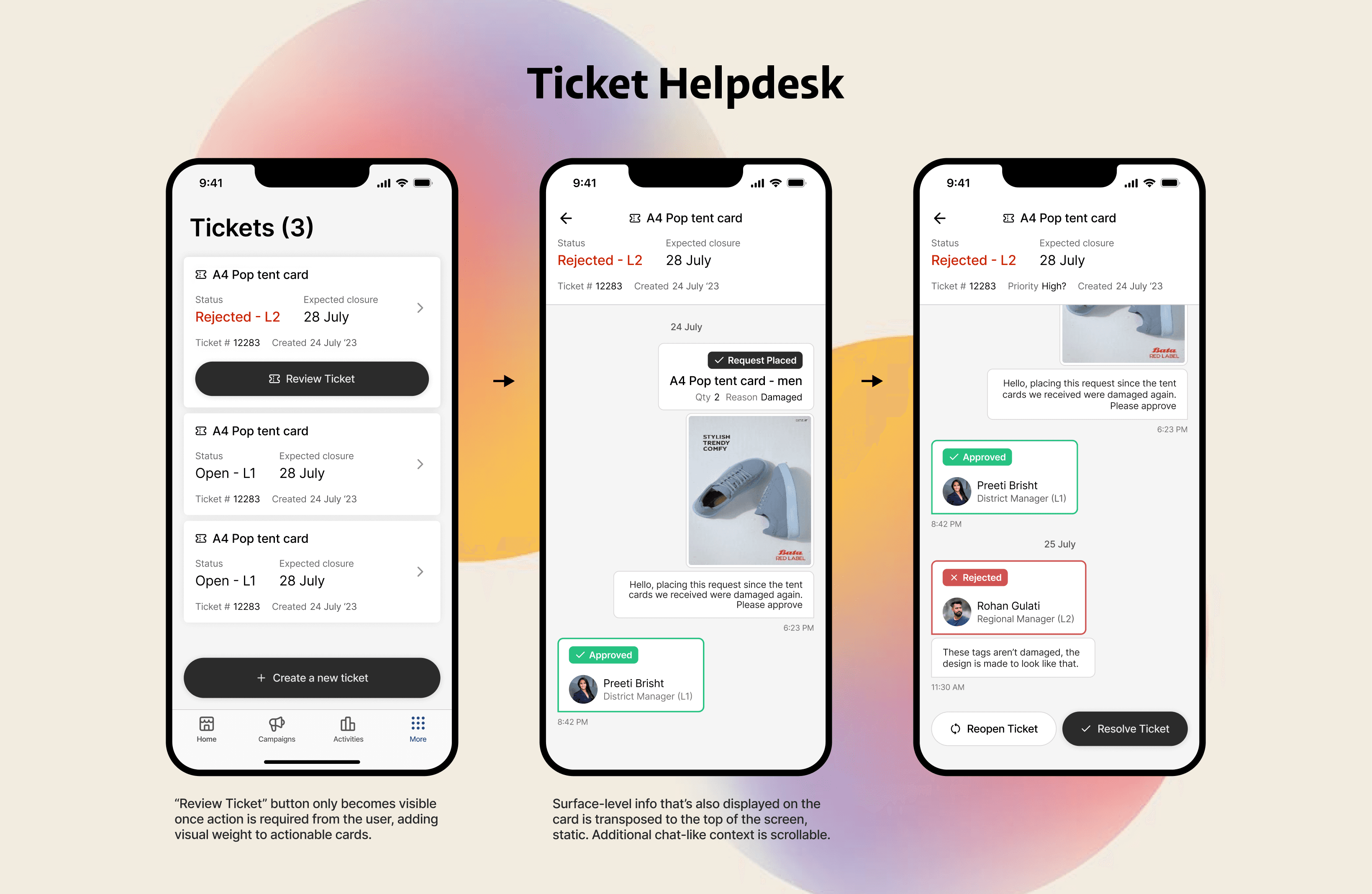
Ticket Helpdesk (new feature): Considering that tickets have a level-of-escalation system and the client wanted the app to be accessible to even those who were unfamiliar with complex management interfaces, we landed on an intuitive messaging-style UI to convey the back and forth between the ticket requester and the levels of escalation, along with any related comments.
Implementing Gamification: As a motivational measure, the client requested the option to gamify campaign completion and task accuracy in order to generate store rankings and reward high-performing stores accordingly. For this, an XP system was developed and implemented as levels, a few of which involved redeemable rewards for the achievement.
Bullet Points: Key Improvements
Simplified, modern user interface
Providing additional, implicit context through UI elements
Reimagined information architecture with task flows in mind
Outcome
Store Managers
After the redesign, HipHip saw an increase in voluntary app usage from 71% to 95% by store managers, owing to the clarified, intuitive flow for campaign tasks. Interestingly, quiz scores increased by 24% despite no major UX changes.
Bata's main KPI was increasing voluntary app usage to 85%, which was achieved and exceeded after a few rounds of iteration.
Higher Level Managers
Process satisfaction among previously frustrated managers increased by 246%, gauged on a 5pt Likert Scale. This increase was seen both in managers who expressed frustration with the previous version of the interface as well as those who were indifferent.
Completely unresolved tasks per campaign (mandatory but uncompleted tasks) reduced by 52%
Abandoned tasks (partially unresolved) per campaign reduced by 66%.
Please see the full case study for an in-depth look at the redesign :)