2023
Kamadhenu

Background
FleetRez, a B2B rental fleet management solution, was facing conversion issues with its customer-facing UI. They reached out with the hopes of pinpointing the issue in their funnel and tackling it with a redesigned interface that streamlined the rental booking process from searching for a car to confirming the payment.
Core problem
Cart abandonment was at 82%, largely due to unclear pricing and a complicated booking process, indicating significant UI-related issues.
The repricing screen was the main funnel drop-off point for users, potentially owing to the convoluted UI and unintuitive information architecture. Users were unsure of which step in the process they were at, and of the additional work required from their end to confirm the booking.
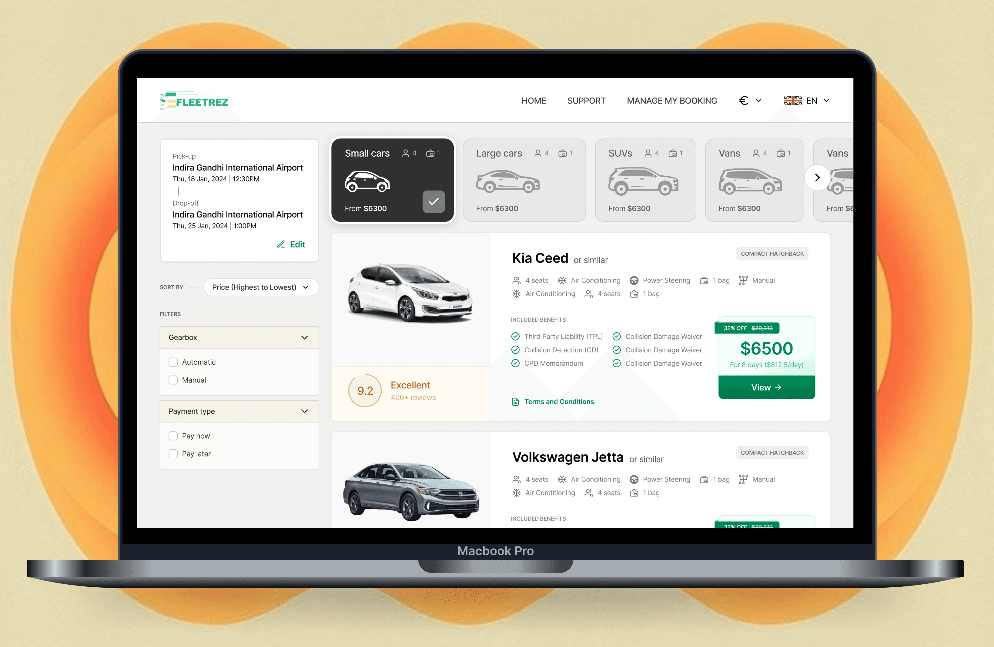
The listings screen, presented after pickup location and dates were selected, wasn't optimizing items per viewport. A balance between presenting the car, providing critical information like included benefits and sharing promotional deals while maximizing listings was unable to be struck.
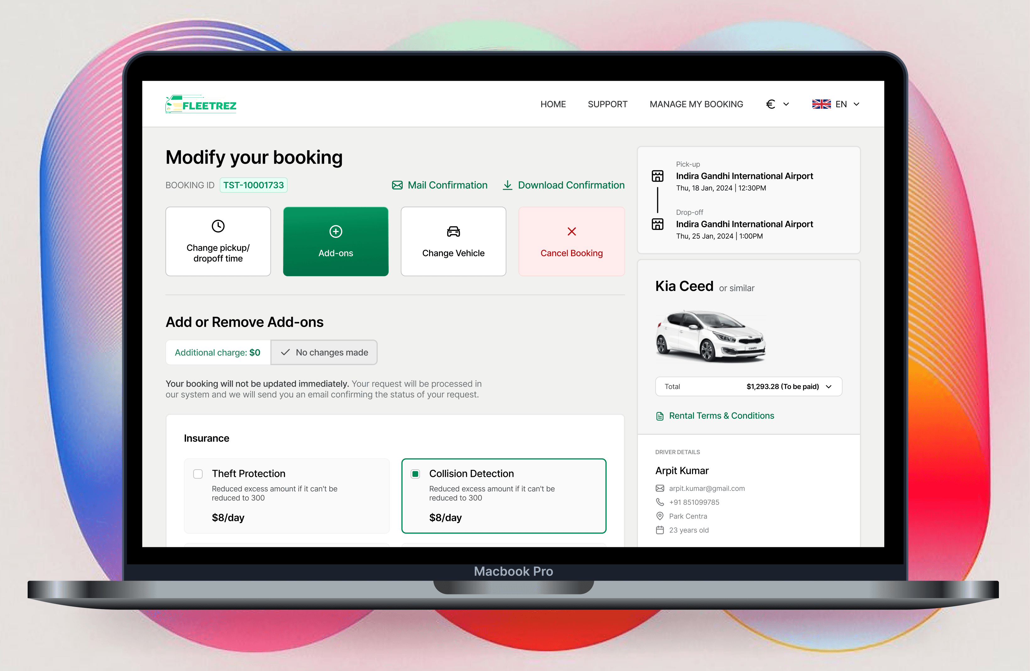
Users almost never modified their booking (when applicable) through the website (only 14%), despite an interface dedicated to booking modification, opting to call support 86% of the time instead.
The Process for FleetRez
I took a data-driven approach, analyzing drop-off points in the user journey and conducting surveys to better understand user frustrations. With this feedback, we developed a new design strategy focused on ease of use and reducing friction during critical tasks.
Key Actions Taken
Revamped Funnel: The selling funnel was restructured into easy-to-follow steps with real-time progress indicators, offering visual affordances for the required information they had to fill out.
Intuitive Booking Modification: The new UI for modifying your booking focused on cognitive load - the old version bombarded the users with all the modifications and sub-options they had within modifications, while the new approach prioritized providing information only relevant to the user's desired modification along with showing the price delta in a contextually appropriate location.
Simplified User Interface: We reimagined the listings page, using clean layouts and a clear color scheme to guide users effortlessly through store setup and management.
Context Where Needed: Taking the user flow into consideration, contextual information was provided in the UI where it previously wasn't. Information like driver details, add-ons and booking ID were made available in screens where they weren't essential but contextually relevant.


Outcome
Within the first quarter post-redesign, FleetRez saw a 20% reduction in cart abandonment (10% lower than the industry standard for vehicle booking websites) and a 40% increase in utilization of the modify booking screen. Additionally, customer support call volume related to booking modifications dropped by 35%, reflecting the enhanced usability and clarity of the redesigned interface. These improvements not only streamlined the user journey but also contributed to increased customer satisfaction and operational efficiency.